The Basics of Data Visualization
Day 21 of 90 Days DataBytes
Have you ever looked at a spreadsheet containing thousands of rows of numbers and immediately closed it because it looked overwhelming?
Well...
You’re not alone (I also struggle with making sense of large intimidating spreadsheets).
Now imagine those same numbers transformed into a colorful chart or graph where the patterns practically jump out at you.
Now that’s the power of Data Visualization.

Welcome to Day 21 of 90 Days DataBytes
Today, we’ll explore what data visualization is, why it is important, and how it helps transform raw numbers into meaningful stories.
What is Data Visualization?
I like to think of data visualization as painting a picture with data to tell the story hidden inside it.
Data visualization is the process of representing data visually using graphs, charts, maps, and other visual elements. Instead of reading hundreds or thousands of numbers, you can simply look at a visualization and quickly understand patterns, trends, relationships, or unusual observations.
The goal is simple:
Turn complex data into information that almost anyone can understand.
Common Types of Data Visualization
Different visualizations serve different purposes. Some of the most common include:
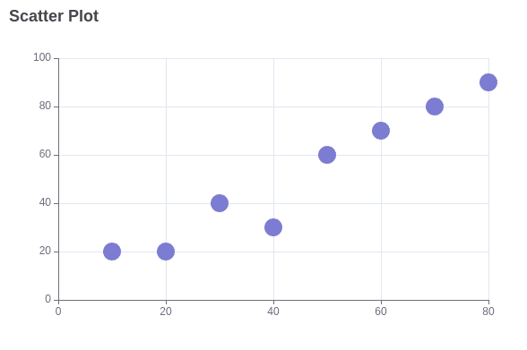
Scatter Plot
Used to show the relationship between two numerical variables. It helps answer questions like, “As one variable increases, what happens to the other?”
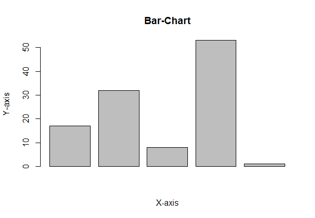
Bar Chart
Used to compare different categories. For example, comparing the sales of different products or the populations of different states.
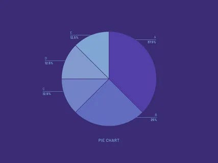
Pie Chart
Shows how different categories contribute to a whole. It is useful for displaying proportions or percentages, although it works best when there are only a few categories.
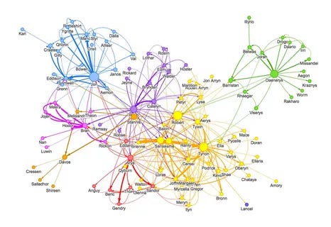
Network Graph
Used to visualize relationships between connected elements. Each item is represented as a node, while the connections between them are shown as lines. Social media connections are a common example.
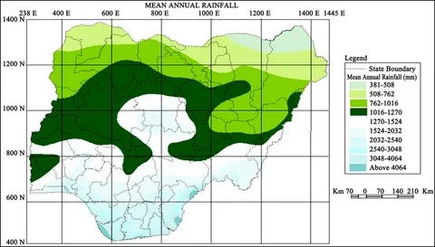
Geographical Map
Used to display data based on location. For example, mapping rainfall across Nigeria or showing the spread of a disease across different states.
Which Chart Should You Use?
One of the biggest mistakes beginners make is using the wrong chart for their data.
Different visualizations are designed to answer different questions.
Comparing categories: Bar Chart, Grouped Bar Chart, Stacked Bar Chart
Showing changes over time: Line Chart, Area Chart
Showing proportions of a whole: Pie Chart
Exploring relationships between variables: Scatter Plot
Understanding data distribution: Histogram
Choosing the right visualization makes your message much clearer and easier to understand.
Popular Data Visualization Tools
There are many tools available for creating visualizations. Some of the most widely used include:
Python
R
D3.js
Tableau
Power BI
These tools allow analysts and data scientists to create anything from simple charts to interactive dashboards that support decision-making.
How to Communicate Effectively with Data Visualization
Creating a chart is only half the job. Communicating the message clearly is equally important.
Here are a few best practices I have come across and always try to implement:
The first is to always tailor your visualization to your audience’s level of knowledge and expertise.
Another is to choose the most appropriate chart for the type of data you are presenting.
Always Include clear titles, axis labels, legends (where necessary), and the data source to provide context.
Keep your visualization clean and uncluttered. Too many colours or unnecessary elements can distract from the main message.
Remember, the best visualization is not necessarily the most beautiful—it is the one that communicates the message most clearly.
Why is Data Visualization Important?
Data visualization is very important when working with data and trying to make decisions based of those data. Visualizing data helps us to do a lot of things, some of which are:
Identify patterns and trends.
Simplify complex datasets.
Communicate insights effectively.
Save time when interpreting data.
Support better decision-making.
Real-World Applications of Data Visualization
Data visualization plays an important role in many industries.
Healthcare
Hospitals use visual dashboards to monitor patients’ vital signs, while public health organizations use maps and charts to track disease outbreaks.
Finance
Investors and analysts use charts such as candlestick charts to monitor stock prices, identify trends, and support investment decisions.
Entertainment and Media
News organizations use interactive charts and infographics to make complex reports and statistics easier for the public to understand.
Government and Public Policy
Governments use visualizations of census, economic, and demographic data to allocate resources, plan infrastructure, and guide policy decisions.
Numbers alone can be difficult to understand.
But when those same numbers are transformed into meaningful visuals, they become stories that people can easily interpret and act upon.
That is why data visualization has become one of the most valuable skills in Data Science, Business Analytics, Healthcare, Finance, and many other fields.
Have you ever seen a chart or dashboard that made complex information instantly easy to understand? Share your favourite example in the comments.
Keep learning. Keep building. Keep thriving.
— Michael Ilenikhena
Subscribe to follow the journey as I explore, learn, and build at that intersection—one DataByte at a time.